

Redesigning Linkedin
Summary
Redesigning Linkedin to deliver optimized user experience through clear interaction that increase the professional network value and growth of the users. This project studies brand, UI/UX, marketing, & business solution project to project the possibility of the next step in the evolution of Linkedin.

The Challenge
The main goal of this project was to redesign LinkedIn’s interface to simplify the overall interactions & create a product that increases its value to the users that use the product.
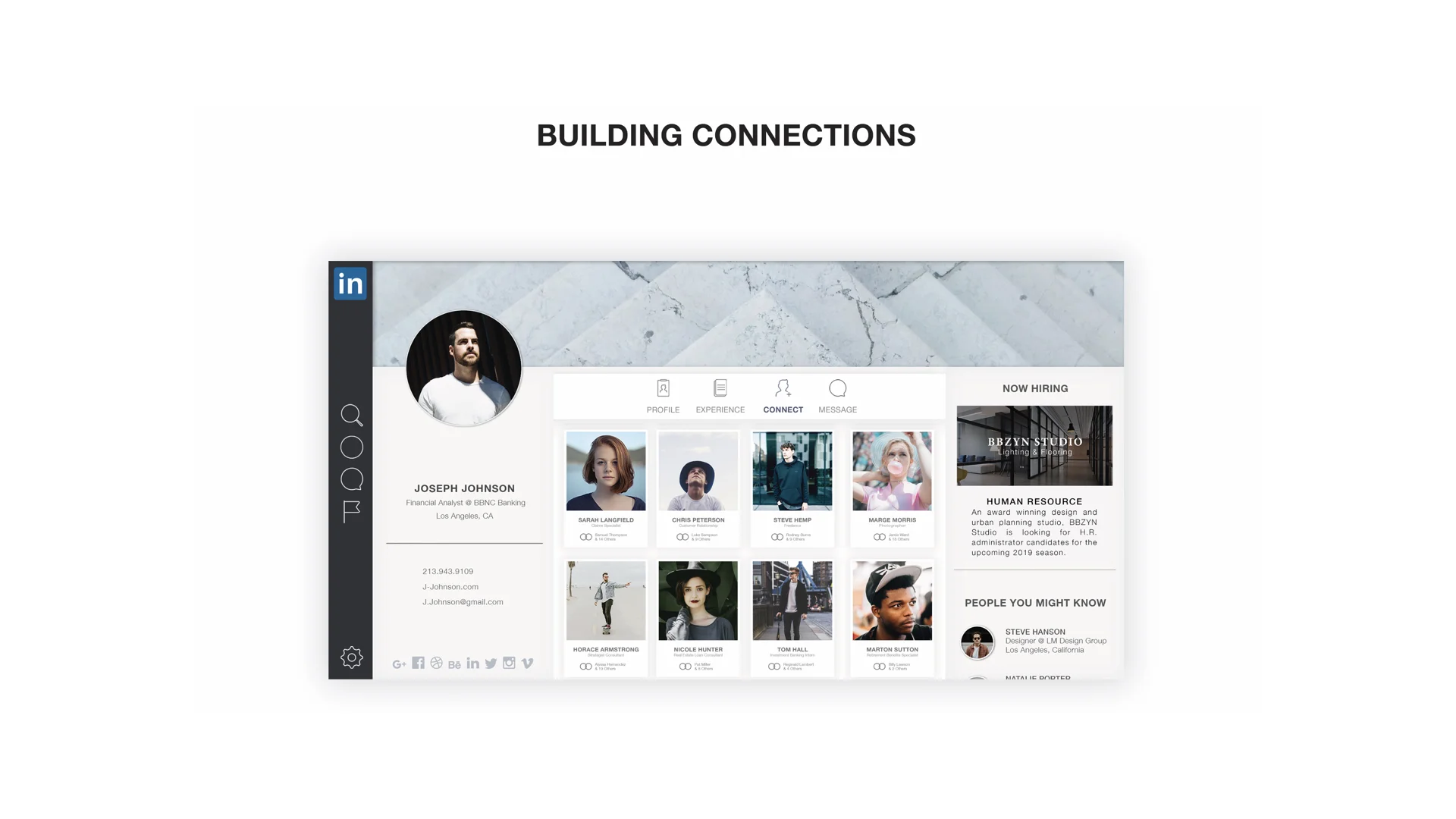
To simplify LinkedIn and strengthen its core strengths of building networking, communication, & relationships.
Building and identifying a strong network that holds mutually beneficial relationships; where both parties benefit.
Creating a profile that is able to adapt and move with the user while taking digital interactions and seamlessly integrating it into the world we live in.

User Painpoints
A growing distrust in strangers
Awkward interaction of meeting strangers
Difficulty remembering
Clarity in identifying others needs
Retaining information
Overload of information
Linkedin as a professional networking platform should not have properties of social media such as social feeds and postings. This creates uncertainty to the identity of the brand and confuses the user base as to how to use the platform. Users were more likely to connect and network when they are assured that the site is strictly professional and interactions online will mirror that of swapping business information and not private information in the real world.
The homepage was removed completely. Instead users are greeted to another users profile. The profiles shown are tailored to the user based on their career, search results, interests, or maintaining long-term relationships. This allows the user to take in that information and create a stronger professional network.


““The Linkedin corporate palette consists of three colors: Linkedin blue, black, & white.
Linkedin Blue is the core of our brand identity & should appear whenever possible for members to immediately identify our brand.””


Hiring Process for Companies

Companies can view the resume and cover letter directly when the candidate apply for the position. The recruiter can then choose to schedule, message, or ignore the applicant.

